Moroccanoil
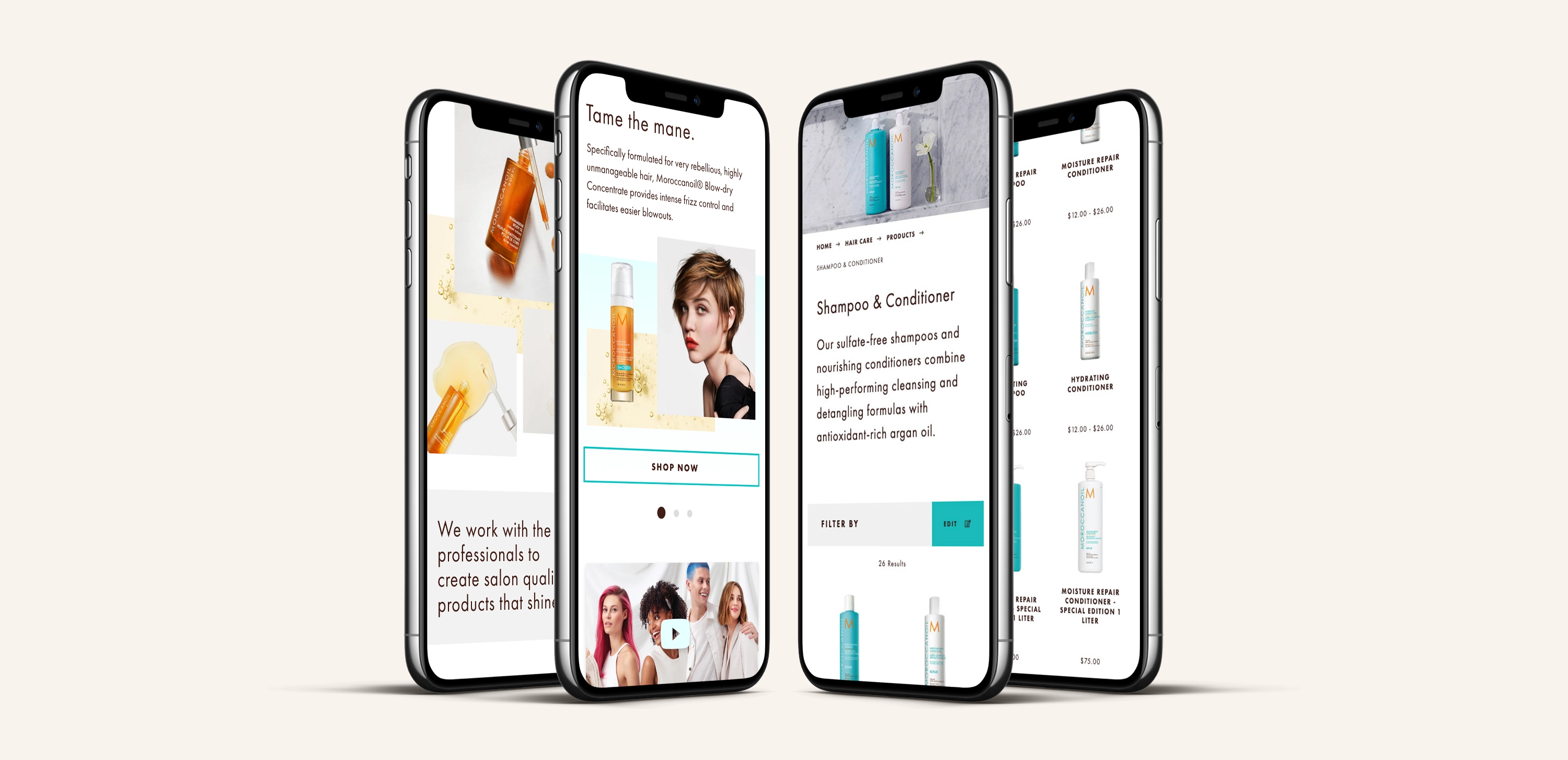
Moroccanoil approached us for a site refresh to address some quirks and give their site an overall facelift. We created an updated pattern library, and the refresh touched nearly every aspect of the site.
// Magento 2 Build Created @ Rightpoint
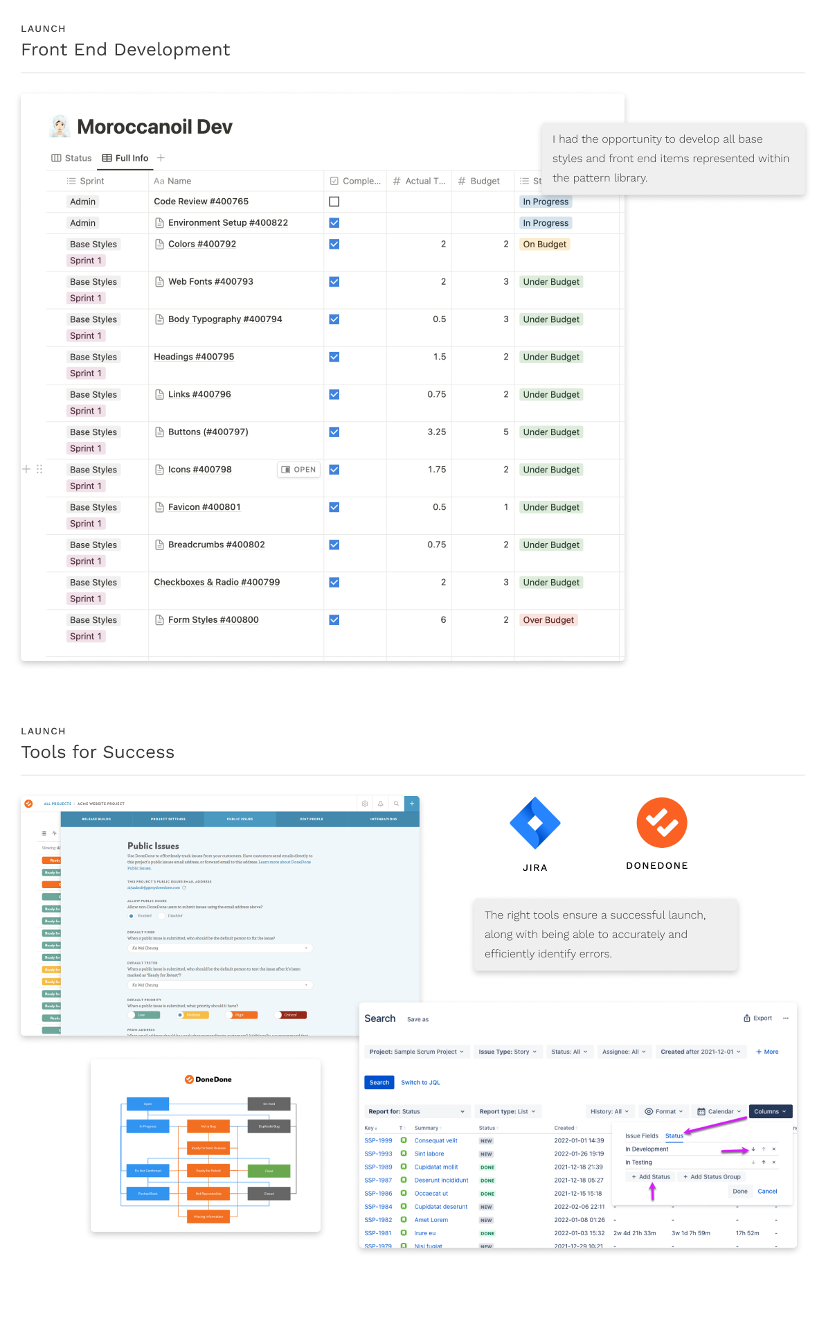
In addition to redesigning the site, I had the opportunity to work on the front end development of several key areas. I found it to be an incredibly enriching experience to be able to take on the dual roles of a designer and a developer for such a highly-regarded brand.
Specifically, I worked on improving the homepage and mini cart which included improving the layout and user flow. I also had the chance to improve the base styles of the site, ensuring consistency across all pages and making updates to improve accessibility and brand consistency. Not only did I gain a deeper understanding of the technical aspects of website development, but I also had the opportunity to flex my creative muscles and explore new design possibilities.
delivery process
Challenge
Design Refresh
Maintain the brands globally recognizable essence, while giving it a youthful refresh.
Solution
After consideration and collaboration with their marketing team, we landed on a sleeker, more minimalist design while retaining their signature color palette and logo. In addition, they added new features and functionality that would improve the user experience and streamline the purchasing process.
Goal
Address Site Bugs
Mitigate a series of bugs such as page freezes, glitchy layouts, and confusing user flows.
Solution
We identified the root cause of these problems and implement effective solutions that not only resolved the issues but prevented similar problems from occurring in the future. We also redesigned areas that had poor layout or confusing user flow to ensure the best customer experience.
Design
Pattern Library
A web UI pattern library is a collection of reusable design components that create consistent and coherent user interfaces. These libraries include things like buttons, forms, navigation menus, and other interface elements.

Design & Development
Homepage
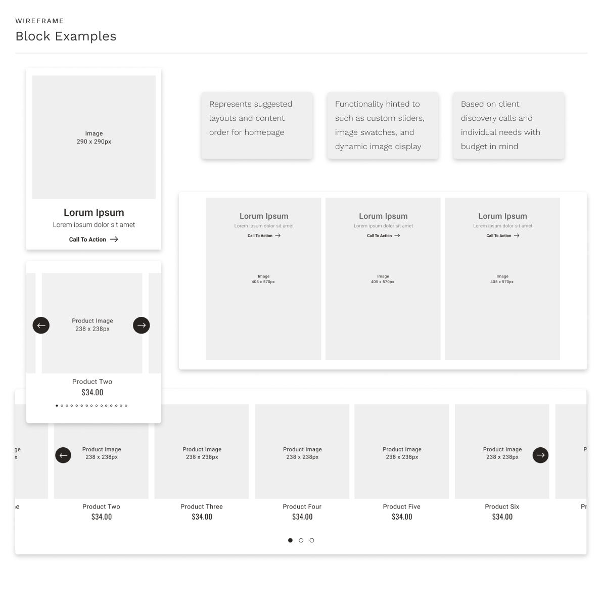
The design is based on the pattern library, which was designed and developed to be used with Magento Page Builder for optimal ongoing customization.


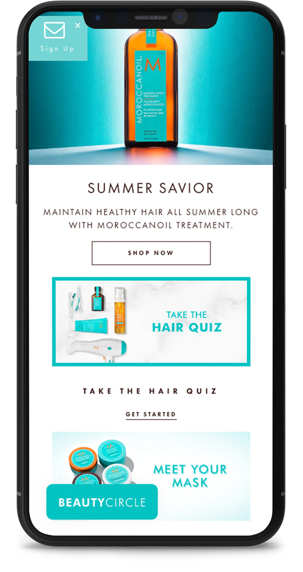
Before
Overuse of Uppercase
Pop-up Overlays
Embedded Image Text
Inaccessible Font Size
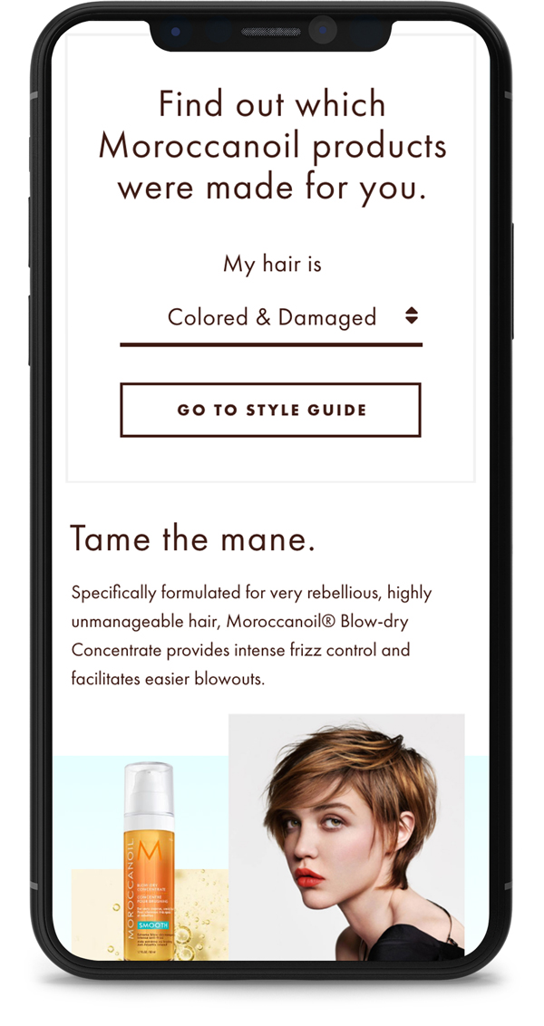
After
Accessible Typography
Removal of Overlays
Interactive Elements
Use of Live Text
Design & Development
Minicart
Previously a small dropdown, I updated the minicart to be a slide-in drawer that provides more space for content information and larger imagery.

Design
Product Detail Page
For the custom PDP design, I have included larger product photography, updated product configurations, more focus on photo reviews, and added extra space to feature product information and video content.


Design & Development
Product Landing Page
The product landing page is to promote larger collections such as "hair" and give emphasis to different types of sub-category products.


